# API Reference

### Component List

| Component                                   | Description                                                          |
| ------------------------------------------- | -------------------------------------------------------------------- |
| [`AmountInput`](#amountinput)               | Numeric input with token/fiat toggle, balance helper and Max action  |
| [`AssetSelector`](#assetselector)           | Token search & pick list with recent items and empty states          |
| [`NetworkSelector`](#networkselector)       | Network picker with gas level indicators and colors                  |
| [`Balance`](#balance)                       | Displays a balance value with optional masking and custom loader     |
| [`CryptoAddressInput`](#cryptoaddressinput) | Address input with QR scan and paste helpers, validation state       |
| [`QRCode`](#qrcode)                         | QR renderer for addresses/payment requests with labeling and styling |
| [`TransactionItem`](#transactionitem)       | Single transaction row (sent/received) with token, amounts, network  |
| [`TransactionList`](#transactionlist)       | Virtualized list of transactions using `TransactionItem`             |
| [`SeedPhrase`](#seedphrase)                 | Grid of seed words with optional editing and loading states          |

***

#### AmountInput

Numeric input component with token/fiat toggle, balance display, and Max functionality.

<figure><img src="https://1705527907-files.gitbook.io/~/files/v0/b/gitbook-x-prod.appspot.com/o/spaces%2F35cNSL3foZ7T6bD7C8uL%2Fuploads%2Fgit-blob-223b40480fe0e2ffb168bbbe194d7552c5c89ac9%2Famount-input-dark.png?alt=media" alt="AmountInput - dark theme"><figcaption><p>
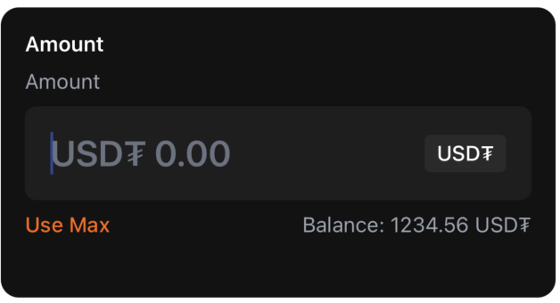
AmountInput (dark theme)</p></figcaption></figure>

**Props**

| Prop                | Type                     | Required | Default          | Description                        |
| ------------------- | ------------------------ | -------- | ---------------- | ---------------------------------- |
| `label`             | `string`                 | No       | `'Enter Amount'` | Field label                        |
| `value`             | `string`                 | Yes      | —                | Amount text value                  |
| `onChangeText`      | `(text: string) => void` | Yes      | —                | Called when text changes           |
| `tokenSymbol`       | `string`                 | Yes      | —                | Token code, e.g. 'ETH', 'BTC'      |
| `tokenBalance`      | `string`                 | Yes      | —                | Token balance (e.g. '1.23')        |
| `tokenBalanceUSD`   | `string`                 | Yes      | —                | Balance in fiat (e.g. '$4200.00')  |
| `inputMode`         | `'token' \| 'fiat'`      | Yes      | —                | Current input mode                 |
| `onToggleInputMode` | `() => void`             | Yes      | —                | Switch between token/fiat modes    |
| `onUseMax`          | `() => void`             | Yes      | —                | Fill with maximum available amount |
| `error`             | `string`                 | No       | —                | Error message to display           |
| `editable`          | `boolean`                | No       | `true`           | Whether input is editable          |

**Example**

{% code title="AmountInput Usage" lineNumbers="true" %}

```tsx
import { AmountInput } from '@tetherto/wdk-uikit-react-native'

function SendAmount({ amount, balance, onAmountChange }) {
  return (
    <AmountInput
      label="Enter Amount"
      tokenSymbol="ETH"
      value={amount}
      onChangeText={onAmountChange}
      tokenBalance={balance.toString()}
      tokenBalanceUSD="$2,500.00"
      inputMode="token"
      onToggleInputMode={() => {/* Switch mode */}}
      onUseMax={() => onAmountChange(balance.toString())}
    />
  )
}
```

{% endcode %}

***

#### AssetSelector

Token selection component with search functionality and recent tokens.

<figure><img src="https://1705527907-files.gitbook.io/~/files/v0/b/gitbook-x-prod.appspot.com/o/spaces%2F35cNSL3foZ7T6bD7C8uL%2Fuploads%2Fgit-blob-2a9078d17beacd0c6cbdc521228913cb62422ebf%2Fasset-selector.png?alt=media" alt="Asset Selector - dark theme"><figcaption><p>
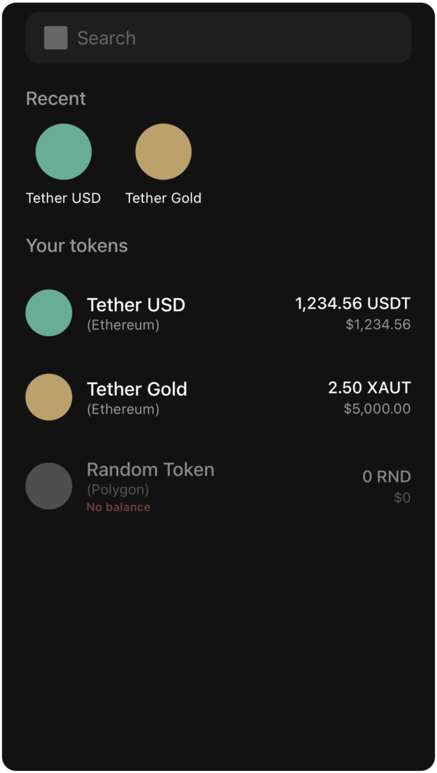
AssetSelector (dark theme)</p></figcaption></figure>

**Props**

| Prop            | Type                     | Required | Default | Description                                |
| --------------- | ------------------------ | -------- | ------- | ------------------------------------------ |
| `tokens`        | `Token[]`                | Yes      | —       | Full list of tokens to display/filter      |
| `recentTokens`  | `string[]`               | Yes      | —       | Array of recent token names for Recent row |
| `onSelectToken` | `(token: Token) => void` | Yes      | —       | Called when user selects a token           |

**Token Type**

{% code title="Token Interface" lineNumbers="true" %}

```typescript
type Token = {
  id: string
  symbol: string
  name: string
  balance: string
  balanceUSD: string
  icon: ImageSourcePropType
  color: string
  network?: string
  hasBalance: boolean
}
```

{% endcode %}

**Example**

{% code title="AssetSelector Usage" lineNumbers="true" %}

```tsx
import { AssetSelector } from '@tetherto/wdk-uikit-react-native'

function TokenPicker({ tokens, recentTokens, onTokenSelect }) {
  return (
    <AssetSelector
      tokens={tokens}
      recentTokens={recentTokens}
      onSelectToken={onTokenSelect}
    />
  )
}
```

{% endcode %}

***

#### Balance

Display component for showing balance values with optional masking and loading states.

<figure><img src="https://1705527907-files.gitbook.io/~/files/v0/b/gitbook-x-prod.appspot.com/o/spaces%2F35cNSL3foZ7T6bD7C8uL%2Fuploads%2Fgit-blob-92ca707f7a9665196db8c5dafe2faea77bfc957c%2Fbalance.png?alt=media" alt="Balance - dark theme"><figcaption><p>
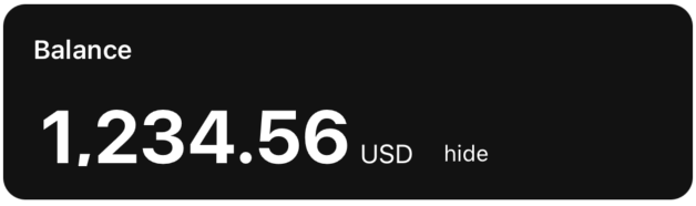
Balance (dark theme)</p></figcaption></figure>

<figure><img src="https://1705527907-files.gitbook.io/~/files/v0/b/gitbook-x-prod.appspot.com/o/spaces%2F35cNSL3foZ7T6bD7C8uL%2Fuploads%2Fgit-blob-f75efc77595b2f22f046b84508ae633d410f0043%2Fbalance-hide.png?alt=media" alt="Balance amount hide - dark theme"><figcaption><p>
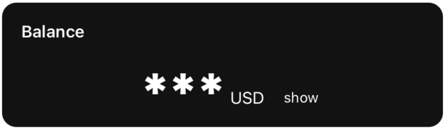
Balance amount hide (dark theme)</p></figcaption></figure>

**Props**

| Prop            | Type                  | Required | Default | Description                            |
| --------------- | --------------------- | -------- | ------- | -------------------------------------- |
| `value`         | `number`              | No       | `0`     | Balance number value                   |
| `isLoading`     | `boolean`             | No       | `false` | Show loading state                     |
| `Loader`        | `React.ComponentType` | No       | —       | Custom loader component                |
| `showHide`      | `boolean`             | No       | `true`  | Toggle hide/show balance functionality |
| `currency`      | `string`              | No       | `'USD'` | Currency label                         |
| `EyeOpenIcon`   | `React.ComponentType` | No       | default | Icon shown when balance is hidden      |
| `EyeClosedIcon` | `React.ComponentType` | No       | default | Icon shown when balance is visible     |

**Example**

{% code title="Balance Usage" lineNumbers="true" %}

```tsx
import { Balance } from '@tetherto/wdk-uikit-react-native'

function WalletBalance({ balance, currency, isLoading }) {
  return (
    <Balance 
      value={balance} 
      currency={currency}
      isLoading={isLoading}
      showHide={true}
    />
  )
}
```

{% endcode %}

***

#### CryptoAddressInput

Address input component with QR scanning and paste functionality.

<figure><img src="https://1705527907-files.gitbook.io/~/files/v0/b/gitbook-x-prod.appspot.com/o/spaces%2F35cNSL3foZ7T6bD7C8uL%2Fuploads%2Fgit-blob-847010ec4bc9eb9ffd8239bb6a135dfc3801dc26%2Fcrypto-address-input.png?alt=media" alt="Crypto Address Input - dark theme"><figcaption><p>CryptoAddressInput (dark theme)</p></figcaption></figure>

**Props**

| Prop           | Type                     | Required | Default                               | Description               |
| -------------- | ------------------------ | -------- | ------------------------------------- | ------------------------- |
| `label`        | `string`                 | No       | `'Recipient Address'`                 | Field label               |
| `value`        | `string`                 | Yes      | —                                     | Address text value        |
| `onChangeText` | `(text: string) => void` | Yes      | —                                     | Called when text changes  |
| `placeholder`  | `string`                 | No       | `'T08p3BGPIuh1l934IIflu....Kc2GXhKc'` | Placeholder text          |
| `onPaste`      | `() => void`             | No       | —                                     | Paste action handler      |
| `onQRScan`     | `() => void`             | No       | —                                     | Open QR scanner handler   |
| `editable`     | `boolean`                | No       | `true`                                | Whether input is editable |
| `error`        | `string`                 | No       | —                                     | Error message to display  |

**Example**

{% code title="CryptoAddressInput Usage" lineNumbers="true" %}

```tsx
import { CryptoAddressInput } from '@tetherto/wdk-uikit-react-native'

function AddressInput({ address, onAddressChange, onQRScan }) {
  return (
    <CryptoAddressInput
      label="Recipient Address"
      value={address}
      onChangeText={onAddressChange}
      onQRScan={onQRScan}
      placeholder="Enter wallet address..."
      error={addressError}
    />
  )
}
```

{% endcode %}

***

#### QRCode

QR code renderer for addresses and payment requests.

<figure><img src="https://1705527907-files.gitbook.io/~/files/v0/b/gitbook-x-prod.appspot.com/o/spaces%2F35cNSL3foZ7T6bD7C8uL%2Fuploads%2Fgit-blob-51e4f9fc5489de13d6690f06bd66d6bf82491d5a%2Fqr-code.png?alt=media" alt="QR Code - dark theme"><figcaption><p>QRCode (dark theme)</p></figcaption></figure>

**Props**

| Prop              | Type        | Required | Default         | Description                     |
| ----------------- | ----------- | -------- | --------------- | ------------------------------- |
| `value`           | `string`    | Yes      | —               | Data to encode in QR code       |
| `size`            | `number`    | No       | `200`           | QR code side length in pixels   |
| `color`           | `string`    | No       | `theme.primary` | Dot color                       |
| `backgroundColor` | `string`    | No       | `'transparent'` | Background color behind QR code |
| `label`           | `string`    | No       | —               | Optional title above QR code    |
| `containerStyle`  | `ViewStyle` | No       | —               | Wrapper style                   |
| `labelStyle`      | `any`       | No       | —               | Style for label text            |

**Example**

{% code title="QRCode Usage" lineNumbers="true" %}

```tsx
import { QRCode } from '@tetherto/wdk-uikit-react-native'

function AddressQR({ address }) {
  return (
    <QRCode
      value={address}
      size={250}
      label="Scan to receive"
      color="#000000"
      backgroundColor="#FFFFFF"
    />
  )
}
```

{% endcode %}

***

#### TransactionItem

Single transaction row component for displaying transaction details.

<figure><img src="https://1705527907-files.gitbook.io/~/files/v0/b/gitbook-x-prod.appspot.com/o/spaces%2F35cNSL3foZ7T6bD7C8uL%2Fuploads%2Fgit-blob-4a01ab27796b0638b60a367efbb436ae53a59298%2Ftransaction-item.png?alt=media" alt="Transaction Item - dark theme"><figcaption><p>
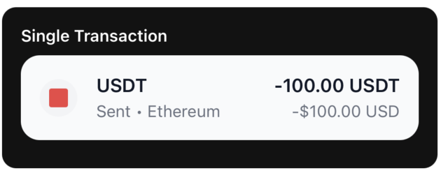
TransactionItem (dark theme)</p></figcaption></figure>

**Props**

| Prop          | Type          | Required | Default | Description             |
| ------------- | ------------- | -------- | ------- | ----------------------- |
| `transaction` | `Transaction` | Yes      | —       | Transaction data object |
| `onPress`     | `() => void`  | No       | —       | Row press handler       |

**Transaction Type**

{% code title="Transaction Interface" lineNumbers="true" %}

```typescript
type Transaction = {
  id: string
  token: string
  amount: string
  fiatAmount: string
  fiatCurrency: string
  network: string
  type: 'sent' | 'received'
}
```

{% endcode %}

**Example**

{% code title="TransactionItem Usage" lineNumbers="true" %}

```tsx
import { TransactionItem } from '@tetherto/wdk-uikit-react-native'

function TransactionRow({ transaction, onPress }) {
  return (
    <TransactionItem
      transaction={transaction}
      onPress={onPress}
    />
  )
}
```

{% endcode %}

***

#### TransactionList

Virtualized list component for displaying multiple transactions.

<figure><img src="https://1705527907-files.gitbook.io/~/files/v0/b/gitbook-x-prod.appspot.com/o/spaces%2F35cNSL3foZ7T6bD7C8uL%2Fuploads%2Fgit-blob-627dc7e10b75f8c9b6500b62a310324b83c15ad0%2Ftransaction-list.png?alt=media" alt="Transaction List - dark theme"><figcaption><p>
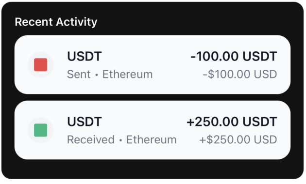
TransactionList (dark theme)</p></figcaption></figure>

**Props**

| Prop           | Type            | Required | Default | Description                  |
| -------------- | --------------- | -------- | ------- | ---------------------------- |
| `transactions` | `Transaction[]` | Yes      | —       | Array of transaction objects |

**Example**

{% code title="TransactionList Usage" lineNumbers="true" %}

```tsx
import { TransactionList } from '@tetherto/wdk-uikit-react-native'

function TransactionHistory({ transactions }) {
  return (
    <TransactionList 
      transactions={transactions}
    />
  )
}
```

{% endcode %}

***

#### NetworkSelector

Network selection component with gas level indicators.

**Props**

| Prop              | Type                         | Required | Default | Description                     |
| ----------------- | ---------------------------- | -------- | ------- | ------------------------------- |
| `networks`        | `Network[]`                  | Yes      | —       | Array of available networks     |
| `onSelectNetwork` | `(network: Network) => void` | Yes      | —       | Called when network is selected |

**Network Type**

{% code title="Network Interface" lineNumbers="true" %}

```typescript
type Network = {
  id: string
  name: string
  gasLevel: 'High' | 'Normal' | 'Low'
  gasColor: string
  icon: string | any
  color: string
}
```

{% endcode %}

**Example**

{% code title="NetworkSelector Usage" lineNumbers="true" %}

```tsx
import { NetworkSelector } from '@tetherto/wdk-uikit-react-native'

function NetworkPicker({ networks, onNetworkSelect }) {
  return (
    <NetworkSelector
      networks={networks}
      onSelectNetwork={onNetworkSelect}
    />
  )
}
```

{% endcode %}

***

#### SeedPhrase

Grid component for displaying and editing seed phrase words.

**Props**

| Prop           | Type                                    | Required | Default | Description                       |
| -------------- | --------------------------------------- | -------- | ------- | --------------------------------- |
| `words`        | `string[]`                              | Yes      | —       | Array of seed words (12/24, etc.) |
| `editable`     | `boolean`                               | No       | `false` | Allow editing of word inputs      |
| `onWordChange` | `(index: number, word: string) => void` | No       | —       | Called when word is edited        |
| `onKeyPress`   | `(index: number, key: string) => void`  | No       | —       | Handle key press events           |
| `isLoading`    | `boolean`                               | No       | `false` | Show loading/generating state     |

**Example**

{% code title="SeedPhrase Usage" lineNumbers="true" %}

```tsx
import { SeedPhrase } from '@tetherto/wdk-uikit-react-native'

function WalletBackup({ seedWords, editable, onWordChange }) {
  return (
    <SeedPhrase
      words={seedWords}
      editable={editable}
      onWordChange={onWordChange}
      isLoading={false}
    />
  )
}
```

{% endcode %}

***

### Next Steps

* [Get Started](https://docs.wdk.tether.io/ui-kits/react-native-ui-kit/get-started) - Quick start guide and basic usage
* [Theming Guide](https://docs.wdk.tether.io/ui-kits/react-native-ui-kit/theming) - Deep dive into theming capabilities
* [React Native Starter](https://docs.wdk.tether.io/start-building/react-native-quickstart) - Complete implementation example

***

### Need Help?

<table data-view="cards"><thead><tr><th></th><th></th><th></th><th></th><th data-hidden data-card-target data-type="content-ref"></th></tr></thead><tbody><tr><td><i class="fa-discord">:discord:</i></td><td><strong>Discord Community</strong></td><td>Connect with developers, ask questions, share your projects</td><td><a href="https://discord.gg/arYXDhHB2w" class="button primary">Join Community</a></td><td><a href="https://discord.gg/arYXDhHB2w">https://discord.gg/arYXDhHB2w</a></td></tr><tr><td><i class="fa-github">:github:</i></td><td><strong>GitHub Issues</strong></td><td>Report bugs, request features, and get technical help</td><td><a href="https://github.com/tetherto/wdk-core" class="button secondary">Open an Issue</a></td><td><a href="https://github.com/tetherto/wdk-core">https://github.com/tetherto/wdk-core</a></td></tr><tr><td><i class="fa-envelope">:envelope:</i></td><td><strong>Email Contact</strong></td><td>For sensitive or private matters, contact our team directly</td><td><a href="mailto:wallet-info.tether.io" class="button secondary">Send an email</a></td><td><a href="mailto:wallet-info.tether.io">mailto:wallet-info.tether.io</a></td></tr></tbody></table>
